

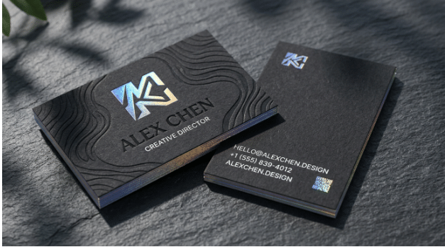
Although digital communication has become increasingly popular in today’s society, a real handshake and a great business card are still valued. A physical card will leave a lasting impression when given to someone, whilst many business cards can be dull and end up being filed away or recycled. To create a great business card, you need to take extra care with how you design your card.
To create a great business card, having a clean design with easy to read fonts and the correct texture of card stock are important. When preparing your card for a networking event, print experts such as AlphaGraphics Northwest Tampa will often highlight that choosing the correct weight of card stock and texture of the card is just as important as the text. By knowing these basics you can create a great looking business card that will leave a lasting impression. Avoiding common mistakes will help ensure your card is easy to read and will contain all the necessary information.
Keep it Clean
One of the most common mistakes made when designing a business card is having too much text. Business cards are only 3.5 x 2 inches therefore adding every single bit of social media links, company history and services offered will cause confusion.
Using white space will help ensure your card looks clean.
- Your name, title, logo, phone number, email address and website should all be included in the main text.
- Leave plenty of space when adding text around the edges.
- Include your main contact information on one side. Add a strong logo or simple pattern on the reverse.
A clean business card will look professional and confident. As it is easy to read, people are far more likely to keep your card.
Choose the Right Card Stock
The texture of your card will give the impression of quality. Using a light card will cause it to easily bend in your wallet, giving a cheap feeling. Choosing a heavier card stock will instantly make you look more professional and shows how much you value your personal brand.
- Standard Card Stock: This is typically around 14pt and will provide a strong, reliable feeling.
- Heavy Card Stock: This ranges from 16pt to 32pt+. This will give your card a very strong, luxurious feeling.
- Textured Card Stock: This can include a linen, cotton or laid finish. This will give your card a textured feel.
Depending on your industry and brand choose the correct weight.
Easy to Read Fonts
The font you choose will determine if your business card is useful or frustrating to read. No matter how creative your logo or colour scheme is, if your phone number is too small to read it will have failed in its main purpose.
Use simple and easy to read fonts. Avoid using a flowery script font. Helvetica or Open Sans are both very good sans serif fonts to use.
- Your name should be the largest font on your card. This should usually be around 10-12pt.
- Your contact information and job title should be 7-9pt.
- Ensure there is a high contrast between your font and background.
Add Some Special Effects
Adding some special effects can help make your business card stand out, but only use one or two. Adding too much foil or gloss can make your card look busy and unprofessional.
- Matte: This will give your card a smooth, modern look. It will also avoid any annoying fingerprints.
- Gloss UV: This will give your card a shiny effect. This will make your colours stand out and protect from moisture.
- Spot UV: This will add a glossy effect to certain areas of your design such as your logo.
Only use one effect that matches your brand.
Hierarchy
Having a good hierarchy will ensure people read the information on your card in the right order. When someone quickly looks at your card what do they need to know?
- Name and Logo: This should be the first thing they see.
- Job Title/Role: This should be second. Let them know what you do in a simple way.
- Contact Info: This should be third. Include your email, direct phone number and website.
This will avoid eye strain and ensure your most important information is quickly taken in.
Double Check
One of the most expensive mistakes you can make with print marketing is finding a spelling mistake after printing 500 copies. The colours and contrast on your screen will not match those on the printer.
- Print off one copy at home or ask your printer for a proof.
- Check every phone number and email address carefully. Ask a colleague to check the layout for any missed punctuation.
- Ensure you have added bleed lines to your design to ensure no important text is cut off.
This will ensure your finished product looks sharp and professional.
Final Thoughts
A business card is one of the most affordable and personal ways of marketing. By keeping your design clean, using high quality card stocks, easy to read fonts and a good hierarchy you will create a physical item that will instantly build trust. Spend some time perfecting your design and using quality materials to give you confidence when handing out your cards.
