




Most engineering teams set up monitoring for their AI features the same way they set up monitoring for everything else: uptime checks, error rate alerts, p99 latency dashboards. Then they ship, and three weeks later the AI feature is technically “up” but producing garbage outputs, costing twice what was budgeted, and nobody has the data to explain why.
Traditional APM tells you your app is running. It does not tell you whether your AI is doing anything useful. That gap is what LLM observability is designed to close.
Why Traditional Monitoring Falls Short for LLMs
A conventional API has a success state that is binary and objective. Either it returned the right data or it didn’t. You can write a test for this. You can alert on it.
LLM outputs are probabilistic. A 200 response does not mean a good response. A model can hallucinate confidently, drift gradually over time as prompts change, produce outputs that are technically valid but wrong for the specific user. None of this shows up in a standard error rate dashboard.
The cost model is also different. A REST API call has roughly predictable costs. An LLM call can vary by 10x or more depending on context length, caching behavior, and which model handled the request. Aggregate spend tells you how much you paid. It does not tell you which feature, which model, or which prompt template is responsible.
LLM observability requires a different set of metrics, collected at a different level of granularity. The good news is that once you have the right data, the patterns become readable very quickly.
The Four Dimensions of LLM Observability
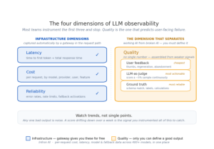

There are four distinct areas to monitor in a production LLM system. Most teams instrument latency and cost, then stop. Quality and reliability are where the signals that actually predict user-facing failure live, and they are the two most teams never get to.
Latency is the most familiar dimension. For LLMs, two numbers matter: time to first token (TTFT), which determines how long users wait before seeing any response, and total response time, which is the full generation duration. These move independently. A model can have fast TTFT but slow total time if the generation itself is slow. Tracking only total latency hides the TTFT problem until users start complaining.
Cost at the request level is different from cost at the aggregate level. You need to know what each call costs broken down by model, provider, user, and feature. When costs spike, aggregate data tells you the spike happened. Per-request data tells you that a specific prompt template started sending 3x more tokens than expected, or that one feature is routing to a frontier model for tasks that don’t require it.
Reliability tracks the health of your provider relationships, not just your application. Error rates by provider, rate limit events, fallback activations, and provider-specific latency patterns are separate from your application error rate. A provider can be degraded in a way that increases latency by 3x without technically erroring, and your application-level monitoring will not catch it.
Quality Is the Dimension That Separates Working AI From Broken AI
Latency, cost, and reliability are all measurable with infrastructure data. Quality is the one that requires real thought, and it is the one that determines whether your AI feature is actually doing its job. A feature that is fast and cheap but producing wrong outputs is not working, and none of the other three dimensions will tell you that. This is the failure mode that ships to production undetected: every dashboard is green, latency is healthy, costs are in budget, and the model is quietly returning answers that are subtly wrong.
The difficulty is that quality has no single number. You assemble it from several weaker signals that, together, are enough to catch degradation before it becomes a user complaint.
The cheapest signal is user feedback. Thumbs up and thumbs down rates, regeneration rates (how often users ask for another answer), and abandonment (how often they give up mid-interaction) are all proxies for whether the output landed. None of them is precise, but a sustained shift in any of them is a reliable early warning.
The most actionable signal is LLM-as-judge evaluation: running a separate model over a sample of your outputs to score them against criteria you define, such as factual accuracy, instruction following, tone, or format compliance. The key insight is that you do not need to evaluate every request to get useful signal. Scoring a sample, often as little as 5% of traffic, is enough to detect a downward trend at scale, and the right sample size depends on your volume and how much your quality varies from request to request. A low-traffic feature may need a higher rate to see the trend clearly; a high-traffic one needs less. What matters is that you are scoring continuously, so a regression in a prompt template or a silent model update shows up as a moving line rather than a surprise in a support ticket.
The most reliable signal, where you can get it, is task-specific ground truth. If the task has a checkable answer, such as extracted fields that must match a schema, a classification that can be compared against a labeled set, or a calculation that is either right or wrong, then measure that directly. Not every task allows it, but the ones that do give you the closest thing to an objective quality metric.
The practical rule: watch trends, not single points. Any one bad output is noise. A quality score that drifts down over a week is the signal you instrumented all of this to catch.
The Metrics That Actually Matter
| Metric | Why it matters | Action threshold |
| Time to first token (p50/p99) | Directly affects perceived responsiveness | p99 > 2s warrants investigation |
| Total response time (p50/p99) | End-to-end user experience | Depends on use case; establish baseline first |
| Cost per request by model | Catches routing issues and prompt regressions | Alert on >20% week-over-week change |
| Token usage per request | Input token spikes often indicate prompt issues | Track separately for input and output |
| Error rate by provider | Distinguishes application errors from provider degradation | Alert on >1% sustained error rate per provider |
| Cache hit rate | Falling cache hit rate means rising costs | Alert on >10% drop from baseline |
| Quality score (sampled) | Catches output degradation not visible in other metrics | Alert on trend, not single-point drops |
| Fallback activation rate | Measures how often primary provider fails | Sudden spike = provider incident |
The first four metrics are infrastructure-level. You can collect them without any application-level changes if you have a gateway layer in place. The last four require slightly more setup but provide the signals that catch the problems traditional monitoring misses entirely.
Where the Data Lives and Why It Matters
The hardest part of LLM observability is not knowing what to measure. It is collecting the data in one place.
Without a central layer, your observability data is fragmented across provider dashboards. OpenAI shows you usage for OpenAI models. Anthropic shows you usage for Claude models. Google shows you Gemini usage. If you are running three providers, you are reconciling three dashboards to get a picture of what your application is actually doing. Per-request attribution requires cross-referencing your application logs with provider billing data manually.
A gateway layer solves this by sitting in the request path and logging every call as it happens. Because the gateway sees every request regardless of provider, it can give you per-request cost, latency, model attribution, and error data in one place without requiring any changes to your application code.
This is the practical reason why observability and gateway infrastructure are closely related. The gateway is not just a routing layer. It is the collection point for the observability data you need to understand what your AI system is actually doing.
How Infron Handles This
Infron sits in the request path, so the infrastructure-level dimensions come for free. Every request through, Infron is logged with full per-request detail: tokens used, cost, latency, model, provider, and whether a fallback was triggered. Because Infron routes across 400+ models and 100+ providers through a single API, all of this data lands in one place regardless of which provider handled the request.
The practical result: when costs spike or latency degrades, you can trace it to a specific model, a specific provider, or a specific time window without cross-referencing multiple dashboards. When a provider has an incident, you can see fallback activations in real time. When a prompt change affects token usage, it shows up in the per-request data immediately.
That covers latency, cost, and reliability. Quality still belongs to you, since only you can define what a good output looks like for your task. But getting the infrastructure dimensions in one place, in a format you can act on, is the part most teams are missing, and it is the foundation the rest sits on.


