


Questions This Article Answers
- How do fewer, clearer choices make a product easier to adopt and use repeatedly?
- Why can “more options” slow conversion and raise operational costs inside a company?
- What can the baccarat game’s “center lane” simplicity teach product teams about guiding users to the next action?
- How does a simple tier structure align Sales, Marketing, and self-serve buyers around one story?
The “few choices” advantage is not about stripping a product down until it is bland. It is about designing a smaller, clearer decision set at every key moment: the first minute, the first action, the first repeat use, the first paid step. Some people are prone to thinking that it can even be relevant to the circular economy as it helps teams reuse and refine what already works, rather than constantly shipping new options.
Fewer choices also create better internal alignment. If there are only a handful of meaningful decisions, teams can improve them deeply, measure them clearly, and defend them when feature requests pile up.
Baccarat is a useful case study because the core experience is already built around clarity. That clarity translates well to digital product design, where the biggest competitor is not another feature list, it is a user’s limited attention. The lesson is simple: if you want speed, confidence, and repeat use, make the next step obvious, and make the number of steps small.
A game built for focused decisions
At its best, the baccarat game is a masterclass in keeping the main loop clean. The player is not asked to configure complex settings before the fun starts. The product does not need a long tutorial to explain what matters most. Instead, the experience can be shaped around a small number of clear actions that repeat smoothly: pick a table, choose a stake, place a bet, see the result, repeat.
This is why baccarat translates so naturally to an online casino environment. The interface can put the “what do I do next?” question to rest in seconds. Many gaming sites that offer baccarat games (and not only) succeed here by treating the first screen like a promise: you can start quickly, and you will not get lost. That promise is itself a strategic asset. It reduces time-to-first-action and makes the product feel welcoming even to people who already know the basics and simply want to get into rhythm.
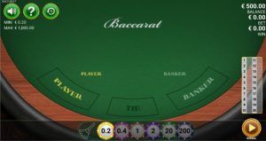

In the screen above, the “middle lane” is very clear. The three main choices – Player, Tie, and Banker, are big and easy to see. Everything extra is removed, and the betting chips sit at the bottom where your thumb can reach them easily. Because of this, you don’t have to wonder, “What do I do next?” The design shows you right away. It’s a good example of a product that respects the user’s attention and doesn’t waste it. Screenshot Source: Here
The strongest implementations use a “center lane” approach: the primary bets are always visible and consistent, while secondary choices appear only when relevant. In practice, this can mean progressive disclosure for side options, a stable layout that does not jump between rounds, and clear feedback that confirms the action without extra prompts. Used well, online baccarat becomes an example of how product teams can protect focus: give users a small decision set, make each decision feel intentional, and keep the loop moving.
Choice as a cost center, not a feature list
In leadership meetings, “more options” can sound like “more value.” In real usage, options have a cost. They take time to scan, compare, and understand. They also multiply design work: edge cases, empty states, copy, support content, analytics, and testing. The cost is not only build time, it is attention.
Research on choice overload is useful here because it makes the cost measurable. A classic field experiment found that a smaller set of jam options led to far more purchases than a larger display. In other words, interest and action are not the same thing.
| Where choice shows up | Choice set size | What happened | Strategic lesson for product teams |
| Retail sampling (jam display) | 6 vs. 24 options | About 30% purchased with 6 options vs. 3% with 24 options | Smaller sets can convert better even when larger sets attract more initial attention |
| Decision strategy under load (reported in research) | 3 vs. 6 vs. 9 options | Use of an “elimination” strategy rose from 21% (3) to 31% (6) to 77% (9) | As options rise, people simplify their thinking, so clarity of defaults and grouping becomes critical |
| Retirement-plan investing behavior | +10 additional options | Equity allocation fell by 3.28 percentage points; “no equity” probability rose by 2.87 percentage points | More options can shift people toward simpler, safer-feeling paths, so curation beats abundance |
Data Sources: UW and Columbia Business School
Changes inside a business
When you reduce choices on purpose, you are not only simplifying a screen but also how the whole company sells and supports the product. Sales teams benefit first because fewer “official” paths make conversations easier to steer. A rep can:
- ask a small set of questions
- map the answers to a small set of packages
- move forward with confidence
Marketing benefits too because messaging tightens. Instead of trying to justify ten variants, you can explain three with real clarity, and buyers remember the differences.
This three-tier pricing layout is “few choices” in business form. It gives buyers a clear self-serve path while giving Sales a simple script: qualify the need, point to Good/Better/Best, and move forward without endless custom debate.
The image was created by us, specifically, for this article.
This matters even more now that many buyers want to move at their own pace. Gartner found that:
- 61% of B2B buyers prefer an overall rep-free buying experience
- 73% actively avoid suppliers who send irrelevant outreach
In that world, a clear self-serve path is a growth lever. Fewer choices help you build that path because it is easier to keep your website, your pricing story, and your sales guidance aligned. Gartner also reported that 69% of B2B buyers see inconsistencies between a company’s site and what sellers say. A smaller choice set reduces the surface area for those mismatches.
On the consumer side, the effect shows up as smoother conversion. Baymard’s meta average for online shopping cart abandonment is 70.22%. While not all of that is fixable, Baymard also notes that checkout forms average 11.3 fields, and that 22% of users have abandoned it because checkout felt too complex. Fewer decisions, fewer inputs, and clearer defaults turn “I will do this later” into “done.”


